Planting by Space, Not Device: Responsive CSS for Real UK Rooms

Photo: Marjory Collins, Public domain, via Wikimedia Commons
There is a particular kind of British optimism in designing a responsive layout around device widths. We imagine a tidy row of pots: phone, tablet, laptop, telly. Each one gets a breakpoint. Each breakpoint gets a slightly wider version of the same plant. It looks orderly in Figma. Then someone opens the click-and-collect page on a foldable phone in a Cornish bakery, or pins the coworking dashboard to a 34-inch ultrawide in London, and the row of identical pots starts to look a bit silly.
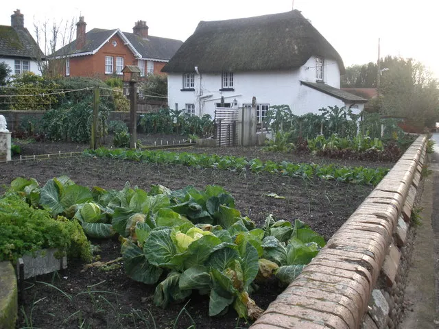
Breakpoints are better understood as garden beds. A bed by a north-facing wall needs different planting from a sunny border. A narrow bed needs different spacing from a wide one. The question is not 'what device is this?' but 'how much room does this component actually have?' That is the shift from device-width responsive design to space-aware layout.
The bakery counter: a container, not a screen
Picture a small bakery in Cornwall with a click-and-collect page. The page has a product list, a collection slot picker, and a basket summary. On a phone, the list is a single column and the basket sits below. On a tablet on the counter, the list and basket sit side by side. On the shop's old desktop, the list has three columns and the basket is sticky.
If you build that with viewport media queries, the component changes shape because the screen changed. But the product list might also appear inside a narrow sidebar on the bakery's parent-brand site. Now the same component has plenty of viewport width but very little container width. The three-column layout looks like a hedge crammed into a window box.
Container queries solve that by letting the component respond to its own patch of soil:
.product-list {
  container-type: inline-size;
}

.product-grid {
  display: grid;
  gap: 1rem;
  grid-template-columns: 1fr;
}

@container (min-width: 32rem) {
  .product-grid {
    grid-template-columns: repeat(2, 1fr);
  }
}

@container (min-width: 56rem) {
  .product-grid {
    grid-template-columns: repeat(3, 1fr);
  }
}
This is not just a technical trick. It is a design-system decision. The product grid now has its own planting plan. It can be dropped into a wide page, a narrow rail, or a modal without the page having to know anything about it.
The coworking dashboard: fluid type and flexible spacing
A London coworking dashboard is a different bed. It is dense, data-heavy, and often viewed on a laptop with a browser window that is not quite full width. Fixed font sizes and hard breakpoints make it feel either cramped or sparse. clamp() helps here because it lets type and spacing scale with the container or viewport without a ladder of media queries.
.dashboard-title {
  font-size: clamp(1.25rem, 1rem + 1.2vw, 2rem);
}

.dashboard-metrics {
  display: grid;
  gap: clamp(0.75rem, 1.5vw, 1.5rem);
  grid-template-columns: repeat(auto-fit, minmax(12rem, 1fr));
}
The important bit is the middle value. clamp() is not a licence to make everything fluid for the sake of it. It works best when the minimum and maximum are deliberate design-system values, and the preferred value is tied to a sensible scaling axis. For a dashboard, you might scale type against the container width rather than the viewport. For a marketing page, viewport scaling may be fine. The bed tells you which.
The Welsh heritage site on a 4K telly
A heritage site in Wales might be viewed on a phone while walking a coastal path, on a laptop in a holiday cottage, and on a smart TV in the evening. The TV is the awkward one. It has a huge viewport, but it is viewed from across the room. Line lengths can become absurd, images can become enormous, and focus states can disappear if they were designed for a mouse at desk distance.
Modern viewport units help with the vertical rhythm. svh, lvh, and dvh describe small, large, and dynamic viewport heights, which matters when mobile browser chrome appears and disappears. But on a TV, the bigger issue is usually measure and scale. Use max-inline-size with ch units to keep prose readable, and let the layout use the extra width for atmosphere rather than more text per line:
.heritage-intro {
  max-inline-size: 62ch;
  margin-inline: auto;
  padding-block: clamp(2rem, 6vh, 6rem);
}

.heritage-gallery {
  display: grid;
  grid-template-columns: repeat(auto-fit, minmax(min(18rem, 100%), 1fr));
  gap: clamp(1rem, 2vw, 2rem);
}
A 4K screen is not an invitation to fill every pixel. It is a larger bed. You still need paths, breathing room, and a focal point.
A planting plan for the design system
The practical takeaway is to stop treating breakpoints as device names. Name them after the space they describe: --bp-compact, --bp-medium, --bp-wide, or better still, let components own their container queries. Document the conditions in the design system. Say which components are container-aware, which still rely on viewport queries, and why.
That documentation matters for teams. A new developer should not have to guess whether a card changes because of the page width or its own width. A designer should be able to see that the bakery product grid and the coworking metric card are responding to different beds. And a QA tester should know which contexts are in scope: a narrow sidebar, a wide dashboard, a TV browser, an in-app browser on a phone.
The great British breakpoint is not a single number. It is a set of gardening notes. This bed is narrow, so plant one column. This bed is wide but viewed from far away, so keep the measure short and the type generous. This component might move between beds, so give it its own container query. That is more work up front, but it produces a layout that can actually thrive in the rooms people use.