Allotment Rules for Design Tokens: Grow Patches, Not a Monoculture
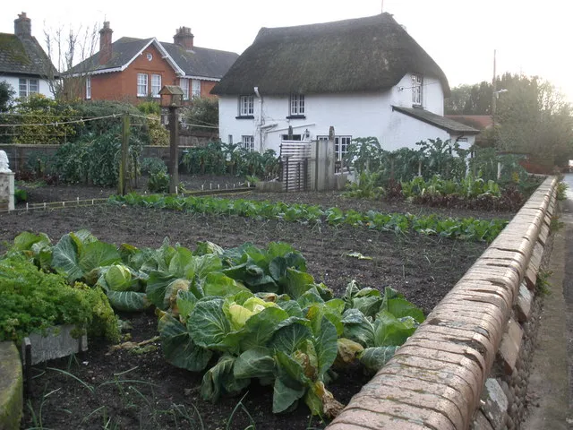
Photo: Roger Cornfoot, CC BY-SA 2.0, via Wikimedia Commons
Every design token system starts as a neat allotment. Someone marks out the beds, writes a seed catalogue, and everyone agrees that this year will be different. Then a brand team plants the same tomato variety in every plot, a campaign launches with its own shade of green, and by autumn the whole site tastes of the same bland crop. The problem is not that tokens are shared. The problem is monoculture.
The monoculture trap
A monoculture happens when one token does too much work. --brand-green becomes the button colour, the link colour, the success message, the chart series, and the focus ring. It works until one team needs a darker green for contrast, another needs a warmer green for a sub-brand, and a third needs a green that survives forced-colors mode. Now everyone overrides the same variable in a different scope, and the cascade becomes a turf war.
The allotment model says: grow shared seed stock, but let each plot hold a crop that suits its soil. In token terms, separate the primitive stock from the semantic intent, then give components their own small beds.
Three beds: primitive, semantic, component
Primitive tokens are your seed catalogue. They describe raw values and should not know about buttons or banners.
@layer tokens.primitive { :root { --green-500: oklch(62% 0.14 145); --green-700: oklch(48% 0.12 145); --space-2: 0.5rem; --space-4: 1rem; } }
Semantic tokens describe purpose. They are allowed to change between brands, themes, and contexts.
@layer tokens.semantic { :root { --colour-action: var(--green-500); --colour-action-hover: var(--green-700); --space-inline: var(--space-4); } [data-brand='oak'] { --colour-action: var(--green-700); } }
Component tokens are the smallest plots. They should default to semantic tokens but can be overridden locally without forking the system.
@layer tokens.component { .button { --button-bg: var(--colour-action); --button-pad-inline: var(--space-inline); background: var(--button-bg); padding-inline: var(--button-pad-inline); } }
That layering is the whole trick. A brand can override semantic tokens in one attribute scope. A component can override its own token without touching the global garden. Nobody has to dig up the whole plot to change a row of cabbages.
Naming is crop rotation
Names should say what a token does, not what it looks like. --colour-action survives a rebrand; --blue-button does not. Primitive names can include a scale because they are raw stock: --green-500, --space-4, --radius-2. Semantic names should include role: --colour-text-muted, --colour-surface-raised, --focus-ring. Component names should include the component: --card-pad, --button-bg.
The test is simple. If a token name would embarrass you after a rebrand, it is a primitive wearing a semantic hat. Move it back to the seed catalogue.
Pests and governance
The first pest is the one-off override. Someone adds --campaign-green to a single landing page, then another page copies it, then it becomes a de facto semantic token without documentation. The second pest is the component that reaches straight into a primitive: .card { background: var(--green-500); }. It looks harmless until the brand theme changes and the card stays the old green.
Governance does not need a committee with a laminated charter. For a small UK agency, a shared token file, a short naming guide, and a pull-request checklist are enough. Ask three questions: is this token primitive, semantic, or component? Does it have a fallback? Would a new brand override it at the semantic layer rather than the component layer? For an in-house team, add a deprecation window and a regular token review, like a plot inspection. Keep the rules visible in the repository, not trapped in someone's head.
Let plots differ without forking
Per-brand overrides belong at the semantic layer, scoped by an attribute or class on the root element. Theme overrides belong there too. Component variants should use component tokens, not new global variables. If a team genuinely needs a different crop, give them a named patch: a data-theme='high-contrast' scope, a brand scope, a density scope. Do not let them clone the entire token system and plant a rival allotment down the road.
The aim is not uniformity. It is resilience. A good allotment has shared water, shared tools, and a shared seed catalogue, but each plot can grow something different without poisoning the soil. Your tokens should work the same way: common primitives, clear semantic intent, local component control, and enough governance to stop one campaign's shade of green taking over the whole site.